Is dark mode worth it?
Joshua MᶜKee
When the Launch Interactive website became overdue for a redo, we decided to make our custom WordPress Theme support both light and dark mode. Given our business creates custom themes, it made sense for ours to showcase what a theme can do. It also gave us an opportunity to build a theme in dark mode, and an example to show clients when proposing it for their website. Building a site with dark mode isn’t without its challenges and the following article outlines a number of challenges that we came across along the way.
What is dark mode?
Dark mode changes the way content is presented on screen. Instead of mimicking paper, with dark coloured content on a field of white, the content is light coloured on a dark background. Users are given the option to view the website in either light or dark mode which is typically set by them in their operating systems settings.
Dark mode has a few advantages:
- Less eye strain from prolonged exposure to light
- Lower power consumption on screens that can turn off areas where less light is required
Challenges of dark mode
1. Extra development time
The initial build of our website took longer in dark mode. For starters, the colours throughout the website had to be coded in a way that could be easily changed. WordPress makes this fairly easy as the colours that are set in the theme.json file are applied using CSS Custom Properties which allows all of the colours to be changed at the body of the document. This required the colours to be named appropriately so that the dark mode variant can be easily understood. We also defined some non-changing colours that work in both light and dark mode.
The other time consuming aspect was the actual choosing of the colours. Our colour scheme was mainly greyscale, so the colours were reasonably easy to tailor, but it wasn’t just a case of changing to the inverse colour and calling it a day. We tailored the colours so they provided appropriate contrast in both light and dark mode separately.
2. Extra thought when creating content
Additional time is required every time we add articles and pages. Every time we make an article, we have to be conscious of both dark and light mode. We need to be asking questions like: Do all of the images work correctly, or do they get lost or overpowered in one or the other colour modes? If we use a custom colour for some text, which WordPress fully supports, does that colour work on both the light background, and the dark one?
3. Images
Images are another challenge we ran into. While photographs generally look reasonable regardless of the background colour, our site has a mixture of logos on it, both ours and client’s. Most of these logos were designed to be on a white background (ours included). This caused them to become unintelligible in dark mode. One solution to this problem is to create two versions of each image that needs to change. This sounded like a lot of work and a management nightmare. Also, this is not an option in WordPress, so we would have had to make custom changes to get this to work. We decided come up with a different solution.
Following the flow chart in our article “What image format should I use?” we had made sure all of the logos were SVG images. SVG allow media queries that allow websites to respond to different colour modes. So we modified the SVGs so that the colours were different depending on the users mode. This means that we only need one image file for both dark and light modes that is very slightly larger in file size.
Below is an example of how light and dark mode work on our website. Notice the way the logos change colours depending on the mode.


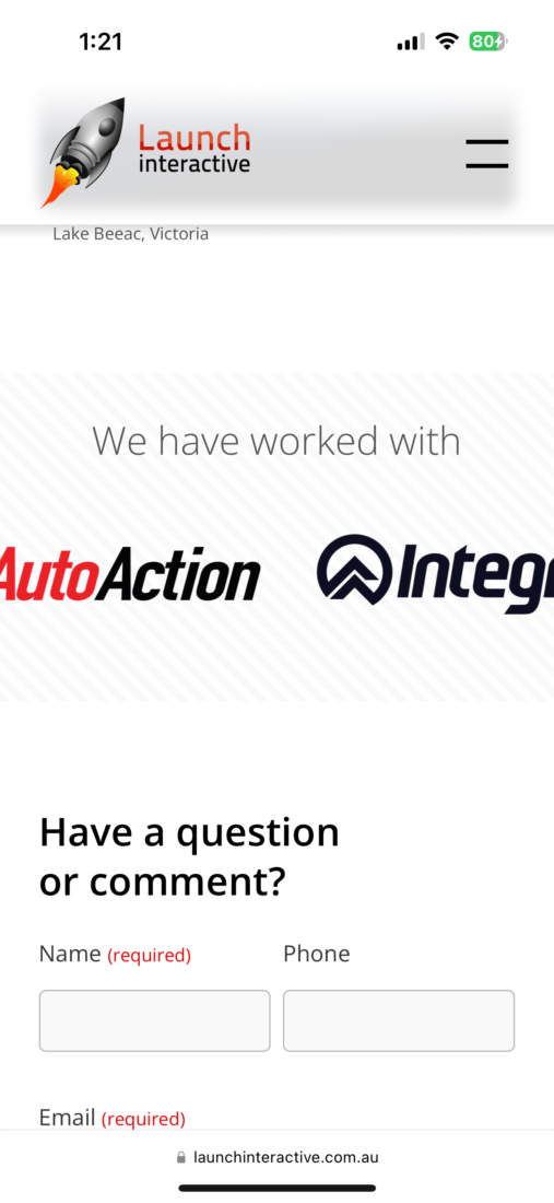
We were very pleased with the result until we realised that this solution doesn’t work in Safari. As you can see from the screenshots below the logos aren’t acceptable.


Safari does not respect the SVG colour mode, even though Chrome and Firefox do. After some investigation we found that there are a couple of ways to solve this issue and we opted for a solution that worked best in WordPress.
Our solution is to add specific Javascript for Safari that converts all of the SVG images to inline images. The script modifies the image contents so that the correct colours for the current mode are used. While this isn’t ideal, we believe this is the best solution for our website. Once Safari fixes this bug then we can remove the script and not worry about it any more.
Is it worth it?
After building our theme with dark mode support, we sat back and asked if it was worth the extra effort. While coding to respect your user’s preferences is generally a good thing, and a dark colour scheme can make the site more accessible for users who have visual impairments, for the majority of websites that we build we don’t believe the benefits outweigh the costs.
Dark mode took more time to build and adds extra time for future updates. The person maintaining the website needs to consider both light and dark mode whenever making a change. What do you think? Is it worth it?
Do you have any questions or need help with light / dark mode on your website?
